What is a dashboard style?
- Definition: A set of colors, fonts and other styling settings used across charts on a dashboard.
- Scope: Styles are applied per story. Changing a style affects only the open story.
Access the style menu
- Open the story you want to format.
- Click the three‑dot menu next to the story title (or the story item in the left list).
- Choose Change style.
- In the style menu
- Select from a preset style OR
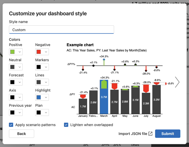
- Click Custom to create a new custom style. The “Customize your dashboard style” dialog opens.
Live preview as you edit
- An Example chart on the right updates instantly as you tweak settings, so you can evaluate contrast, readability, and scenario emphasis before applying.
What you can customize
- Colors
- Positive, Negative, Neutral
- Markers, Lines, Axis
- Highlight
- Previous year, Plan, Forecast
- Options
- Apply scenario patterns
- Lighten when overlapped
- Style name: Give your style a memorable name.
- Import JSON: Load a saved theme configuration file.
Importing JSON themes
- Supports Zebra BI for Power BI Custom Themes as well as Zebra BI for Office JSON theme formats.
- If your JSON also includes settings which affect font sizes & colors, these will also be applied to the custom style.
Apply and save
- Click Submit to:
- Save the style to your personal library.
- Apply it to the current story only; all charts re-render with the new style.
- Ensure new charts in this story inherit the style automatically.
Reuse and manage styles
- Open Change style anytime to:
- Apply any saved style to the current story.
- Edit or delete your own styles.
Tips
- Use distinctive colors (and patterns) for Previous year, Plan, and Forecast.
- Pick a strong Highlight color for key bars and variances.
- Enable Lighten when overlapped for dense visuals.